Website Redesign
This is the third iteration of my website—the previous designed and built in 2008 while at NSCAD. I thought I’d go through a comparison and give a rationale for some the the choices I made during this re-design; exposing part of my process.
Version Two
As I said, I designed version two near the ned of my time at NSCAD, starting in the Fall of my final year. I’d built and worked on plenty of sites by then, but with a CMS only twice before—one Joomla atrocity and one using TextPattern, so this became another TextPattern site.
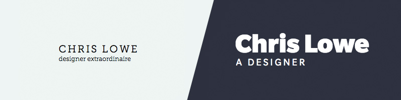
I used Museo Slab and Sans from Typekit and tried to design something that felt like it portrayed my personality. In hindsight, aside from the type choices, I’m still happy with the site. The grid allowed for well balanced pages and I don’t feel that the version looks too dated six years later.
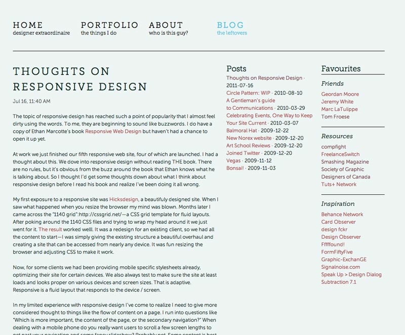
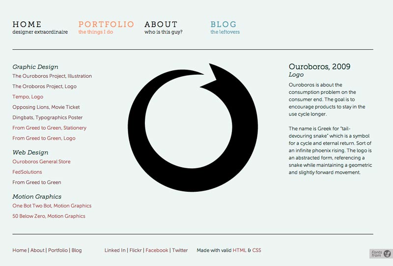
Below are a couple sample pages from version two, a blog page and a portfolio page. You can’t really compare the portfolio page to anything in this current version, but it give a sense of the grid and hierarchy of content.
Version Three
So, for the redesign there were a few important things I wanted to accomplish.
- Highlight new skills and knowledge
- Write more
- Focus on typography
I decided to postpone the portfolio section in the interest of getting it done; which sort of fails on point one above. The reason is, I don’t need to feature work right now because I’m not looking for new work. Of course, I want to design a nice portfolio and I will; but it’s not that high of a priority at the moment.
I sketched ideas / wire frames for a variety of homepage layouts, but in the end I decided to take cues from those designers I respect most, such as Trent Walton, Jason Santa Maria and Elliot Jay Stocks. Something the three of these guys have in common is a focus on their blogs / articles first—their work comes second. I don’t have delusions of being of their calibre, but I like their similar approaches to personal sites design—beautifully styled but still somewhat understated; meaning they aren’t too sales focused.
I decided my approach to the blog would be primarily as an educational tool for myself. Similar to my Stoicism blog, this will become a place to formulate ideas and opinions and record things learned throughout my career. Any business side effects will be welcomed, but that isn’t the purpose.
Structure
The homepage differs from the blog in a few ways. On the homepage the most recent article is displayed in full followed by the next four recent posts and an introduction in the right hand column. The blog lists all posts with an image (if provided) and an excerpt.
Other content pages—About Chris, Contact and Portfolio—are very simple layouts displaying type at a readable line length. I tried to stay focused on the minimum requirements; there is no need to excessive graphics or fake charts proclaiming unverifiable levels of skill.
Grid
The grid is a simple six column grid. Currently there isn’t need for anything more complex due to the nature and simplicity of the content. As the content evolves—especially with the introduction of a proper portfolio—the grid may also evolve to accommodate more complex data and interactions; but that is to be determined.
Typography
I pondered and experimented with type for some time; having difficulty in figuring out what typeface speaks in my voice.
In some ways I think it’s a fool’s errand to find for the perfect typeface; at least on the web. There are elements out of your control; such as the web font service, that may not have the specific typeface you want. I feel you shouldn’t be so attached to a design decision that it cripples you. There will be acceptable alternatives to a typeface within the web font libraries of any of these services. With that in mind I chose Slate from fonts.com for a few reasons:
- Slate is a beautiful typeface designed for both screen and print.
- It’s a large family with enough variety in weights I could accomplish a clear hierarchy with a a single family.
- It appears professional but not conservative.
- It’s designed by Canada’s own Rod MacDonald, who also taught me while at NSCAD.
Colours
I took inspiration mostly from my wardrobe. I have lots of dark greys and blues, but also a variety of brighter colours in shirts. I chose a slate blue for the primary, a deep and rich purple as a secondary and green for a tertiary colour.
I like to work with three colours because they allow me to assign functions to the colours—better codifying the interface. Slate is presentational, for static content. Purple is interactive, used for text links—mostly is article titles. Green is also interactive, but reserved for buttons where an action is executed such as “search” or “sign up.”
There are theories around the split of the colours, such as 60/30/10, which are a good guide, but kind of hard to maintain accurately in a site with changing content. I feel the important thing here is to define a style guide for yourself and stick with it.
Conclusion
So that’s the rationale behind this design. Lately, I’ve become more interested in the idea that design evolves over time. Now that I have WordPress in place and my base theme I can make adjustments as I see fit. I expect that I will eventually start adding some textures and or lighting effects to help make the style a tad more interesting; it currently looks a bit too trendy for my liking, being quite “flat” but, as I touched on in another article, I think this is a natural and honest style for a website, especially one focused solely on content.
I welcome all and any feedback; I miss the days of art school where we had to pun our work up and listen respectfully to the critique of peers.
