Truth in design — on flat design and style
Dec 11, 2013 1 CommentMatt Gemmell’s article on tail wagging triggered some thoughts on truth in design and on style. With recent uproars over flat design and iOS7 here’s my two cents worth.
A design is true if it fulfils its requirements judiciously, and yet surprises and delights its intended audience. An app is true if it has a purity of vision and focus, and serves its intended customers on their terms.
Source
Matt’s article is a great read that begins about speculations on the design of Jonny Ive’s iOS 7. That’s a whole other thing, but when he began writing about truth in design something resonated.
I’ve always thought of truth in materials, something I picked up from an interest in architecture and craftsmanship. Now that I’ve considered that I feel I have a landmark to aim for, truth in web design.
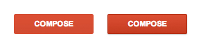
The hot drama these days is of course flat versus skeumorphic. Before any debate one much first define the sides of the argument. I think flat design means different things to different people. To some it is the complete absence of decoration—typically manifesting as the removal of texture, lighting (gradients and drop shadows) and rounded corners. This would be the Adolf Loos approach; whose lecture and writings on ornamentation have a lot of lessons for modern designers. Google’s UI design may be the epitome of flat design for others—which in my opinion is a very well restrained use of design elements to indicate interaction while remaining relatively flat. Google uses subtle shading and shadows in interface elements; such as the compose button in gmail.
Letterpress is another excellent example of flat design. It’s design feels more honest than some flat dribbbles. The difference being that is the style for letterpress is true to the core of the game. The game was built from the ground up and has a minimalist approach to it’s structure. Also, the game is really just about letters and letting users move them into a region of the screen. The app lacks a lot of flash and flair which allows for a clean and refined experience. The letters aren’t burnt into faux wood tiles because that colour and texture would distract from the letter.
I believe there is still a place for skeumorphism in interface design, especially as we continue to enter markets and industries previous apart from the web. If for some reason we find ourselves designing web based interfaces for pilots to remotely control their planes, we would likely do the user a service by referencing the complex physical interfaces they are familiar with now.